In one word, Jaguar’s rebrand is brutal. It’s a classic case of a bold move backfiring—widely mocked and alienating a loyal customer base. While rebrands are meant to breathe new life into a brand, this one feels more like an identity crisis. They sure did make a lot of noise for everyone to start talking about it. But is it good for the brand? If yes, then how exactly? Maybe only time will tell whether the dust will settle on this one. Learning from the past, Airbnb's controversial 2014 refresh, have proven to have impressive staying power.
A few things that left me questioning about this rebrand:
The new tagline: “Delete Ordinary.” While it sounds punchy, it doesn’t mean much. The claim that the brand is “returning to its original essence” feels a bit disconnected, especially when the execution abandons everything that once made Jaguar iconic. Instead of capturing the brand’s storied legacy and emotional connection with its audience, the new look and launch film feel more akin to a fashion brand than a luxury car manufacturer.
If “delete ordinary” was meant to honor the car’s essence and its buyers’ emotions, the rebrand missed the mark. Jaguar’s past campaigns were masterclasses in sharp alignment - messaging, visuals, and tone worked seamlessly with the brand’s DNA.
Here’s a thought: Legacy isn’t a burden - it could be an asset if used right.

Jaguar already had a pretty solid and a timeless logo with the sans serif typeface. Sure, EV brands are expected to look modern, sleek, and futuristic, but there are ways to achieve that without stripping an identity down to something unrecognizable.
Good design marries the future with the past, building a bridge between heritage and innovation. What Jaguar delivered is more of a generic aesthetic - could easily be mistook for a tech startup or lifestyle brand than a luxury automobile company with decades of history.
At its core, Jaguar is a luxury car brand, EV or not. But the rebrand somehow did not prioritize the car. Instead, it leans heavily into performative diversity: gender-fluid models in androgynous clothing, pink-hued hellscapes as backdrops, and a complete departure from the visceral emotion of driving a Jaguar.
This raises the question: Who exactly is this for?
Jaguar’s audience - the loyalists who admired the brand for its sleek sophistication - could hardly relate to the new imagery. Luxury cars are about aspiration, power, and emotional resonance. Was the objective to just get people talking?
It’s clear Jaguar wanted to reposition itself, shedding the weight of past losses. That’s understandable.
This is exactly where there was an opportunity to carve out a bold new statement in the EV landscape while honoring Jaguar’s rich history. Smart rebranding retains the essence of the past while signaling a brighter future without abandoning the identity in the process.
(Not a big fan of could-have-beens and should-have-beens, but well.. here we are.)
This rebrand could have been a moment of reckoning - a chance for Jaguar to stand tall as a leader in the EV market, blending its storied legacy with cutting-edge technology. Instead, we’re left with an identity that feels uncharacteristic, incomplete, and devoid of depth.
The EV space is already becoming dangerously homogenous. Too many brands are chasing the same minimalistic, hyper-modern aesthetic, leaving individuality in the dust. Jaguar had a golden opportunity to stand out by leveraging its unique history and charm - but instead, it blurred itself into the crowd.
Rebranding is risky. When done right, it breathes new life into a brand while honoring its roots. But Jaguar’s attempt feels more like a leap into the void.
Because, let’s face it, nobody wants to drive a car—or align with a brand—that looks like every other one out there especially in the luxury segment.

Alarm clocks are essential tools of modern life, yet for many, they trigger stress rather than support a smooth transition into wakefulness. This in-depth research report explores the overlooked relationship between alarm sound design and the body’s morning stress response, tracing the evolution of alarms and the cultural habits that shaped them. It examines how sonic characteristics directly affect cognition, mood, and physiological arousal upon waking.

For the last decade, the marketing mandate has been simple: Speed. Identify the trend, mimic the trend, monetize the trend. But the machinery of cool has broken down. The trend cycle, which once moved on a breathable 20-year loop, has collapsed into a hyper-accelerated blur of micro-aesthetics that rise and die in weeks. It is time to stop chasing. It is time to build Cultural Antibodies.

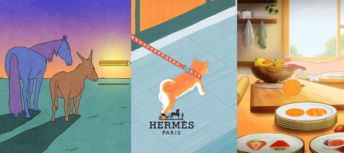
Hermès commissioned nearly 80 creatives - illustrators, animators, artists, to generate social-content aligned with “Drawn to Craft.” That means instead of traditional product shots or celebrity ads, you get a mosaic of artistic interpretations keyed to craft, heritage and creative vision.
Drop us a note and we’ll
schedule a free consultation.