
Brand Strategy | Brand Tone & Voice | Messaging | Creative Direction | Art Direction | Logo design | Visual identity | Product Packaging | Sound design | GTM Launch
Building a contemporary heritage saree brand, that’s rooted in modern restraint and quiet luxury.
Brand creative
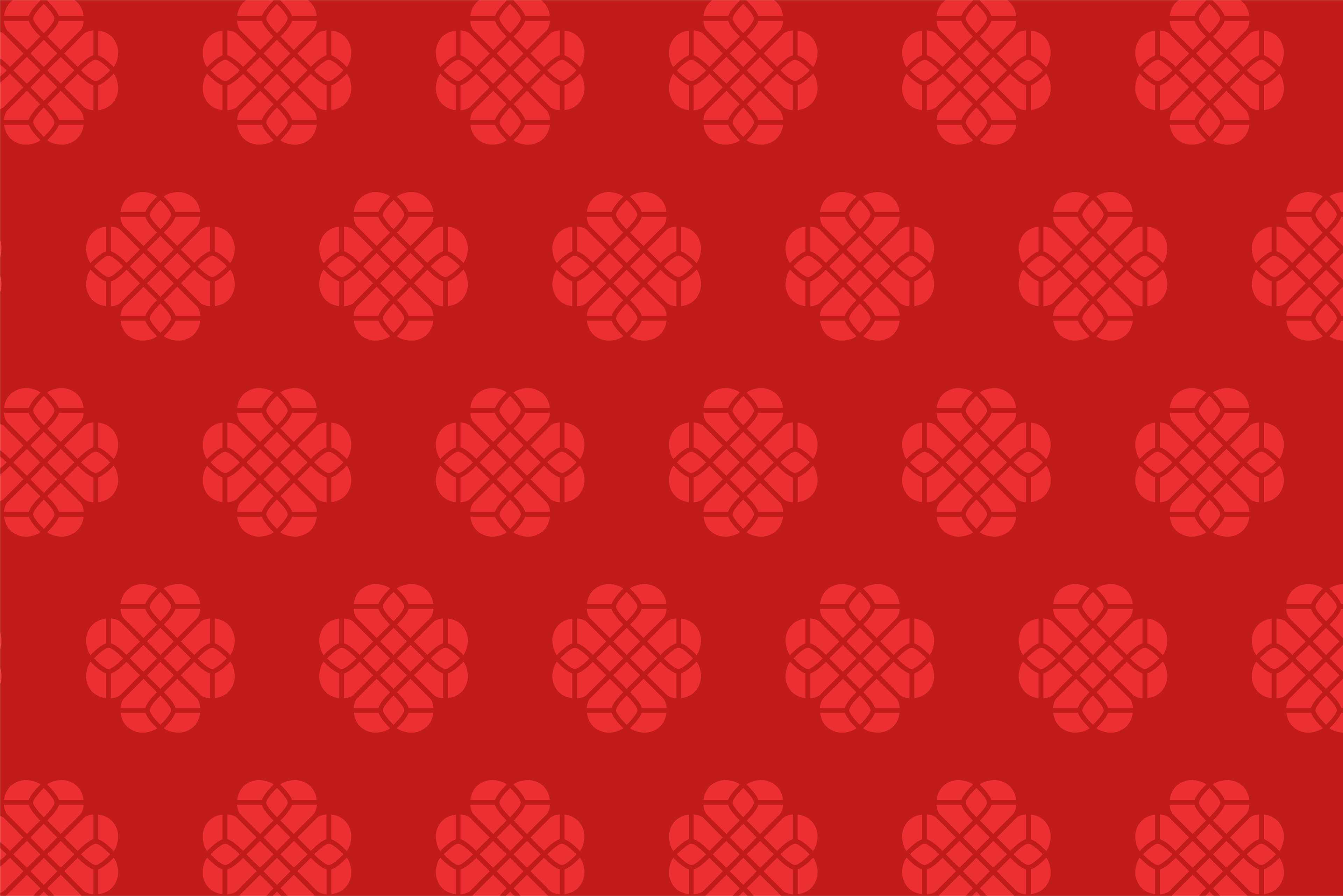
Logo
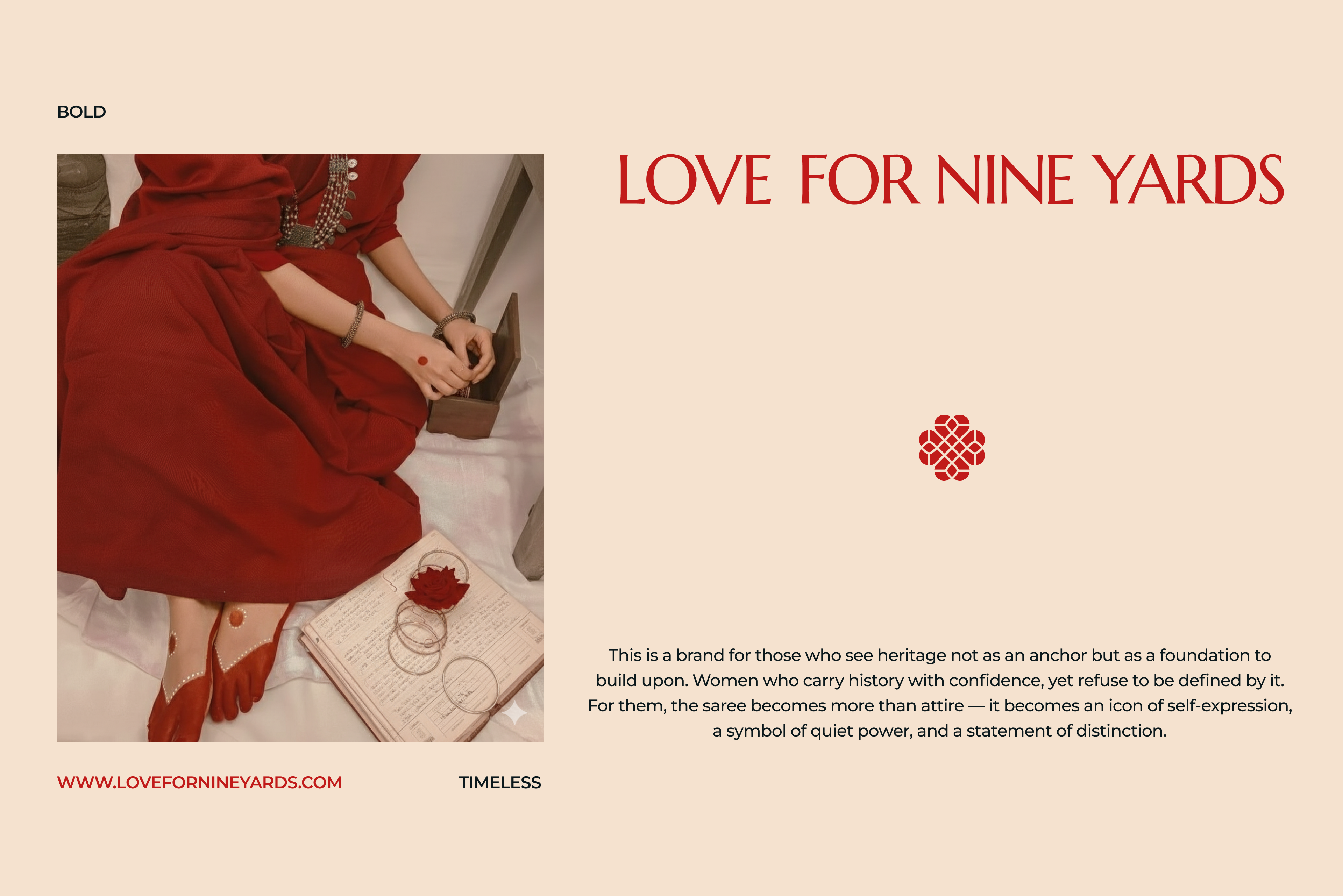
Some projects arrive like calendar invites; functional, expected, and routine. But Love For Nine Yards arrived differently and quietly, like something familiar finding its way back home.
When the founders reached out to us, they came with clarity and conviction. They weren’t looking to build just another saree brand. They were building something rooted in heritage, a brand that understood the saree not as occasion wear, but as a living form that holds the past and present in the same fold.
For us, that distinction mattered deeply. A saree isn’t just a garment. It's a memory you can touch, an identity you can drape, and heritage that moves with the body and changes with time.
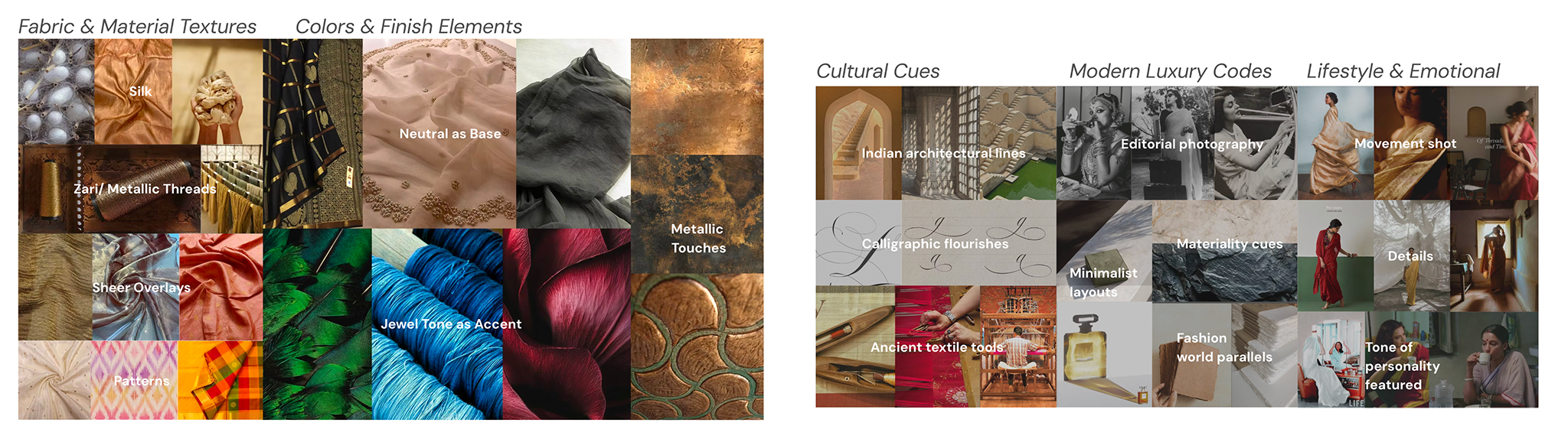
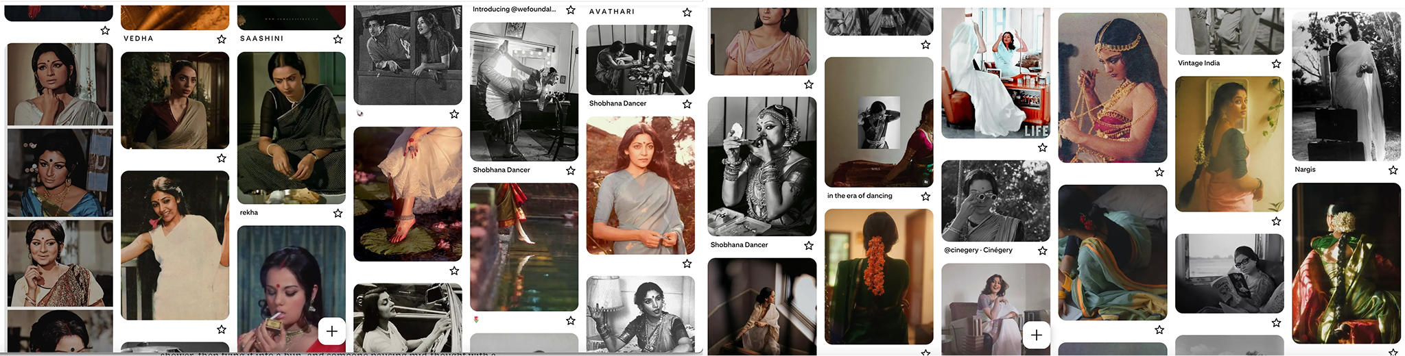
Moodboard that shaped the way how the brand was built.
The brief was simple: to create a modern saree brand that respected heritage without romanticizing it into nostalgia. The saree wasn’t something to be preserved in a glass case, but is something alive and sculptural.
The founders described the saree as sculpture; one that’s shaped by the body and completed by movement. This insight became our anchor.
We realized the brand had to live at the intersection of cultural depth and modern restraint. It needed to embody quiet luxury; the kind that whispers, never performs.
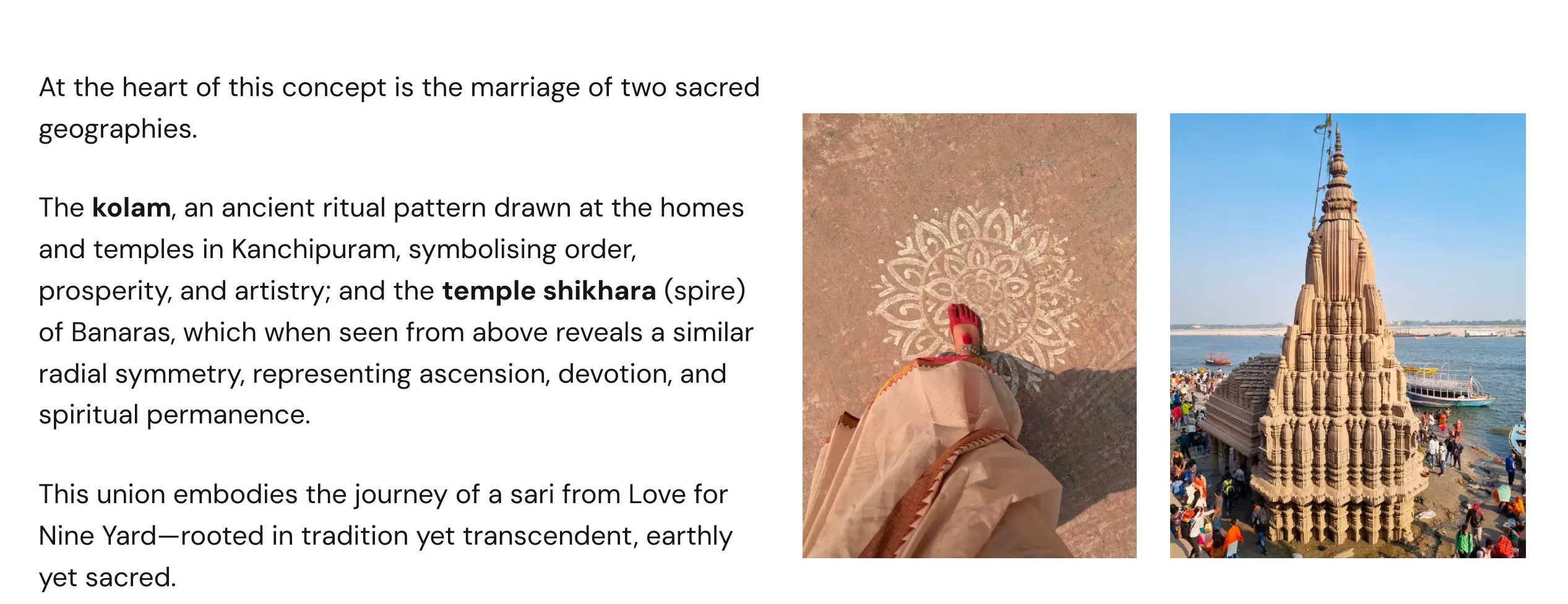
The union of two geographies that became the foundation of the brand's visual identity
The muse who shaped the world of Love For Nine Yards
The breakthrough came when we began looking not at trends, but at geography, form, and the cultural systems that have shaped the craft for centuries. The identity found its anchor in what we came to call Sacred Symmetry, a union of two spiritual geographies that define the saree’s lineage.
From the South, we drew from the kolam geometry of Kanchipuram, a symbol of order, ritual, and artistry. From the North, we found resonance in the shikhara (spire) of Banaras temples, whose radial symmetry mirrors that same sense of balance when viewed from above. When these forms came together, the result felt inevitable.
The mark carried structure and emotion in equal measure, subtly echoing the heart, holding space for the “love” in Love For Nine Yards.
This wasn’t just a logo. It was a philosophy and a visual expression of the brand’s core belief that heritage is not static, but moving.
With the identity grounded, we moved into the sensory world of the brand.
For Love For Nine Yards, color was treated with reverence. The palette was led by Garbhagriha Red, named after the sanctum sanctorum of a temple symbolizing depth, devotion, and permanence. This was balanced with Sandalwood Beige for silence and restraint, and Obsidian Loom (Black) for a modern, sculptural edge.
We made a conscious decision to resist seasonal palettes and trend-led variation, so that the brand could feel timeless like the sarees themselves.
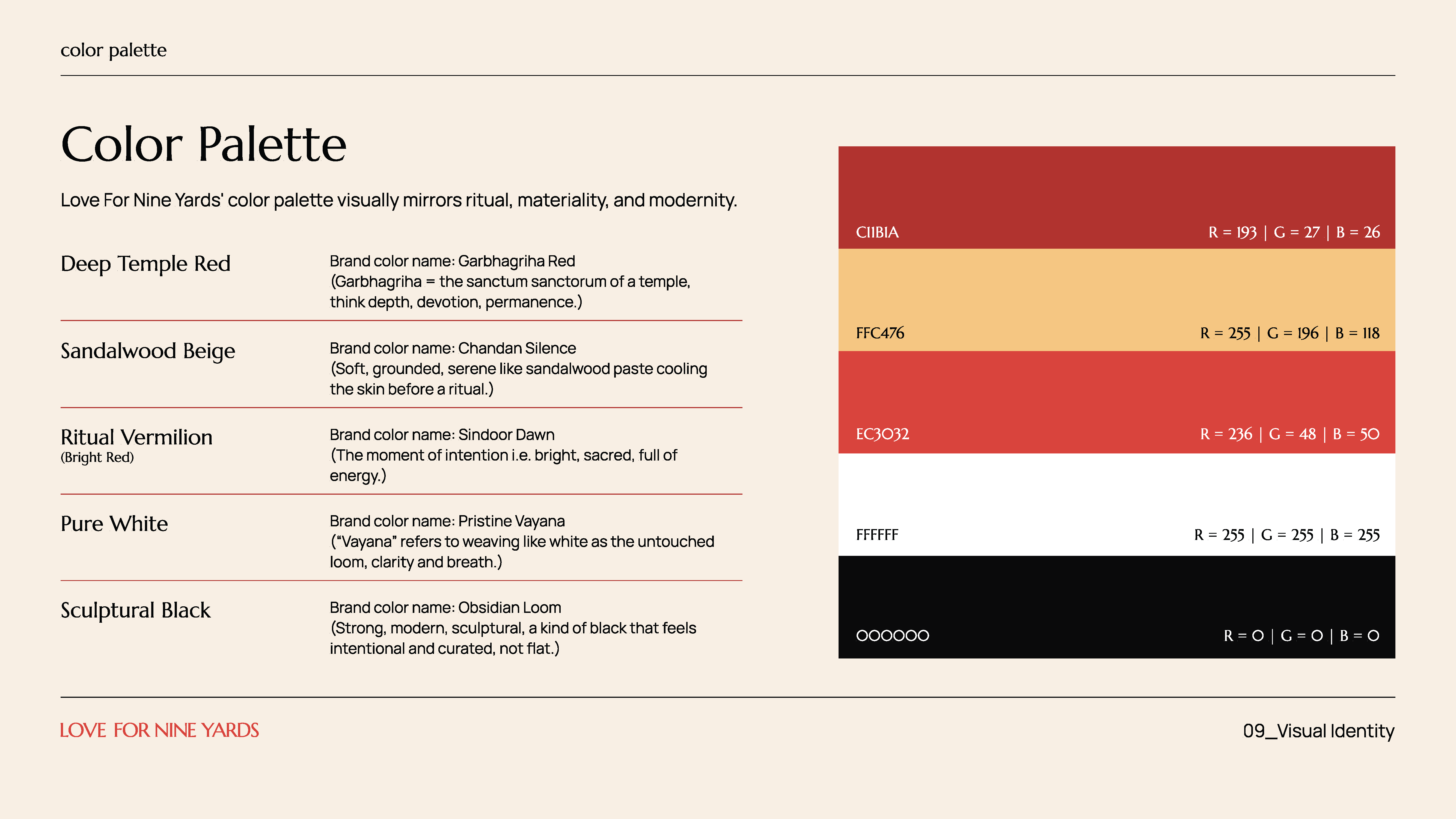
Color palette
The muse that grounded Love For Nine Yards
At the heart of Love For Nine Yards was a quieter, more deeper question: who is this brand truly for? Not in a persona-driven, demographic sense, but in a lived-in, human way.
The answer was clear. This brand could never be about the saree performing for the camera, but about the women inhabiting it. The muse wasn’t a model, but someone who was instantly recognisable—a mother, an artist, a teacher, a dancer, a homemaker, a designer. These women wear saree not to be seen, but because it feels like an extension of who they are.
This philosophy shaped the photography and art direction of the brand. We avoided spectacle, stiffness, and choreographed drama; instead, we focused on moments that can’t be staged.
The saree wasn’t styled onto her, but moved with her.
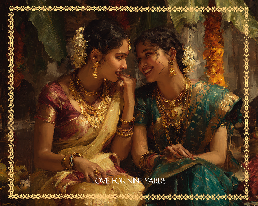
Human-AI brand illustration
The same restraint guided the illustration system for the brand. We didn’t want to incorporate literal motifs or historical references, but extend the brand’s world in an interpretive, lived-in, and intentionally imperfect way.
To bring this to life, we used AI tools such as MidJourney and Gemini’s Nano Banana. Much like the saree itself, AI is a system refined over time. When guided with intention and taste, it doesn’t replace craft but responds to it. With this, we explored new visual rhythms while staying deeply respectful of the brand’s restraint and values, and not imitating the past.
Every illustration was shaped, edited, and curated with discipline to ensure that nothing felt too ornamental or excess. These illustrations, in many ways, became another kind of drape that’s fluid, open, and allowing space for the woman to arrive.
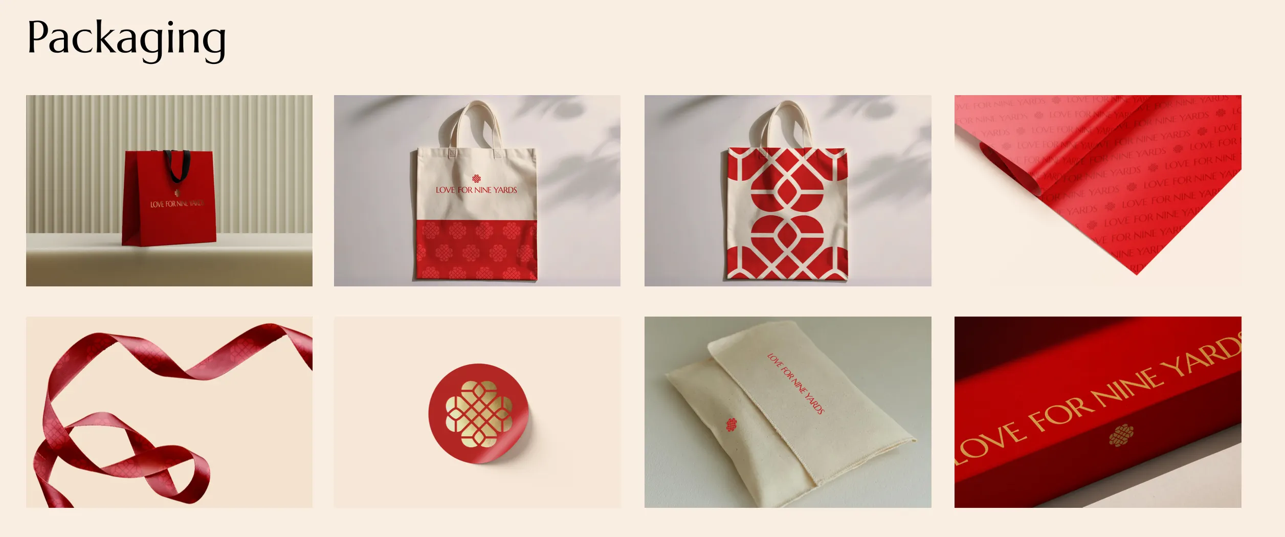
Packaging design
For a brand rooted in contemporary heritage, the experience couldn’t end at identity. It had to extend into the moment the saree reached the customer’s hands.
We designed the entire packaging system from scratch, treating it not as a container, but as a ritual vessel. Deep red tote bags, archival stationery, and ribbons that unspooled like fabric. The unboxing experience was designed to feel like entering a memory.
Scent played a crucial role as well. We introduced sandalwood for purity and jasmine for celebration, because in India, memory is sensory. We wanted the faint sweetness of jasmine and the warmth of sandalwood to be felt before the silk was even touched.
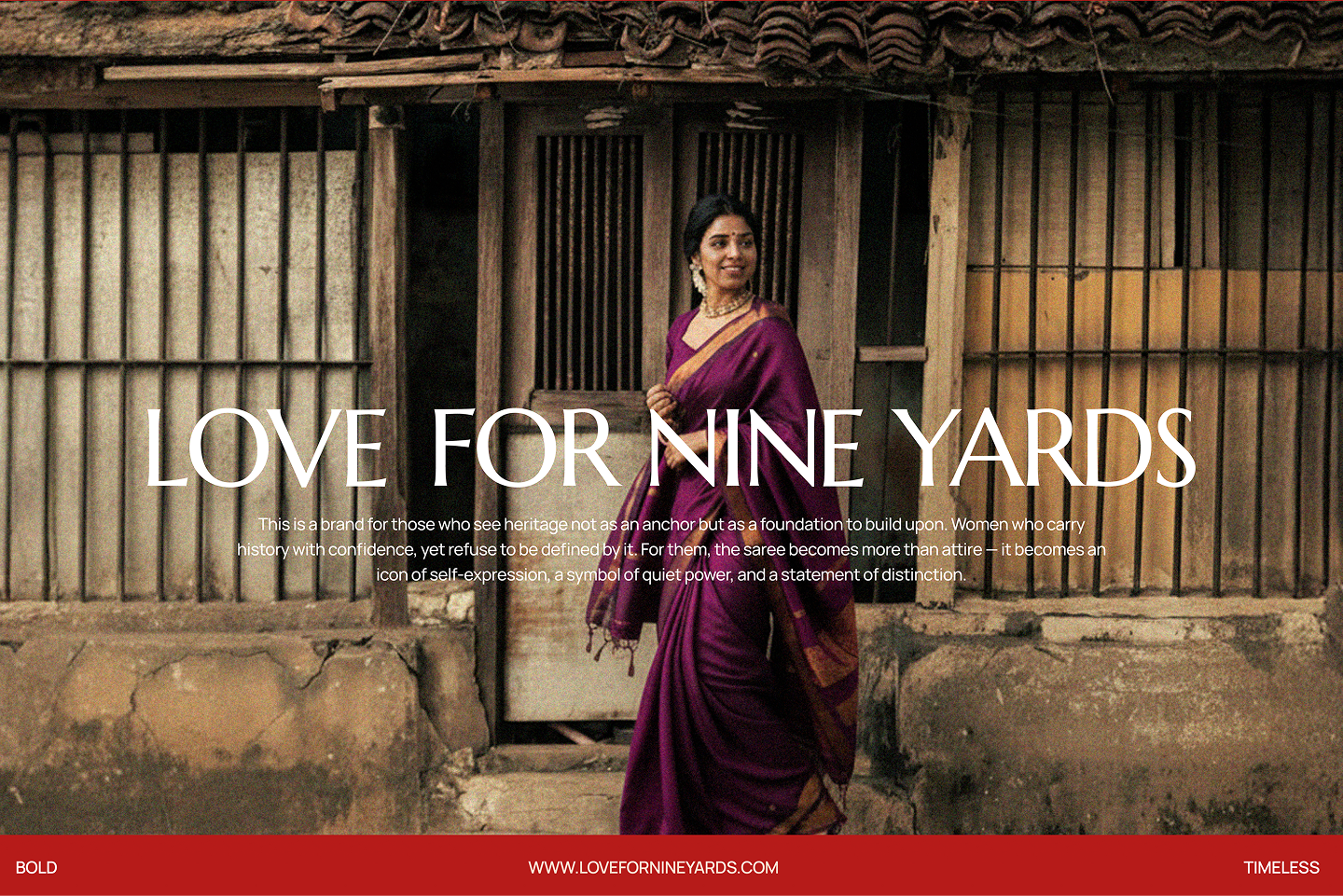
Ad creative
As the brand took shape, one truth kept returning: no two drapes fall the same. The saree takes the form of the woman wearing it, absorbing her values, her history, her rhythm. It’s passed down, yet never stops becoming.
Love For Nine Yards doesn’t rely on nostalgia or opulence. It creates space for the cultural minimalist, a woman who sees the saree not as costume, but as sculptural individuality.
Watching Love For Nine Yards move from a conversation with two passionate founders into a living, breathing brand was unforgettable. What emerged wasn’t nostalgia-led or opulent, but a brand that occupied the space for the cultural minimalist, someone who sees the saree not as costume, but as sculptural individuality.

Darjeeling Design Co.
VO-437, WeWork Embassy TechVillage, Block L,
Devarabisanahalli, Outer Ring Road, Bellandur,
Bengaluru, Karnataka 560103

